
5 Website Redesign Mistakes That Quietly Kill Your Conversions
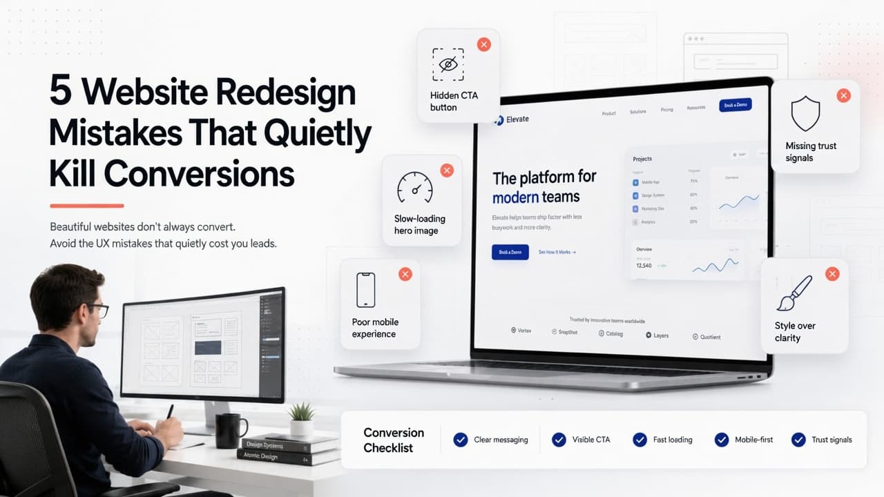
5 Website Redesign Mistakes That Quietly Kill Your Conversions
There's a specific kind of disappointment that only shows up a few weeks after a website redesign launches. The new site looks great. Everyone on the team is proud of it. And then someone checks the analytics and quietly asks: why are we getting fewer leads than we were on the old site?
It happens more often than most agencies will admit. A redesign can genuinely look better and perform worse at the same time, because looking better and converting better aren't the same project, even though they're usually bundled together.
Good design isn't really about looking current. It's about helping someone find what they need, trust what they're looking at, and take the next step without having to think too hard about it. Here are the five mistakes that most often get in the way of that, and what actually fixes each one.
1. Prioritizing Style Over Clarity
What it looks like: The new homepage is genuinely impressive, big, bold headlines, smooth animations, a striking layout, and minimal text. And yet visitors seem oddly unsure about what the company actually does.
Why it hurts: People decide within a few seconds whether they're in the right place. If the homepage leans on clever copy or an artistic layout instead of just telling visitors what you do, a lot of them leave before they ever scroll far enough to figure it out. Design is supposed to support the message. When it starts replacing the message instead, that's usually the moment conversions quietly start dropping.
The fix: A homepage should answer four questions almost immediately: what you do, who you help, why someone should choose you, and what they should do next. A clean, simple layout paired with clear messaging beats a highly creative one almost every time. Clever is memorable. Clear is what actually converts.
2. Burying the Call-to-Action
What it looks like: The "Book a Call," "Get Started," or "Request a Quote" button is technically there, it's just hard to find. Maybe it's tucked inside the navigation menu, maybe it blends into the background, maybe you have to scroll halfway down the page before it shows up at all.
Why it hurts: Someone who's already decided they're interested shouldn't have to hunt for what to do next. Every extra second spent searching for a button is another second where they might just close the tab instead.
The fix: The primary call-to-action needs to sit above the fold, look unmistakably clickable, stay consistent across the site, and use language that says exactly what happens next, "Get Started," "Schedule a Call," "Start Free Trial." It shouldn't be a design puzzle. It should be the easiest thing to spot on the page.
3. Oversized Hero Sections That Slow Everything Down
What it looks like: The homepage opens with a beautiful full-screen image or a background video that took the design team weeks to get right. It also takes several seconds to load, especially on a phone with an average signal.
Why it hurts: Speed is part of the experience, whether or not it's treated that way during a redesign. A gorgeous page that takes four seconds to load will lose visitors before they even see how gorgeous it is, particularly on mobile, where patience runs out fastest.
The fix: Compress images before they go anywhere near the site. Use modern formats like WebP instead of defaulting to whatever the designer exported. Lazy-load anything below the fold. And be honest about whether a background video is actually improving the experience or just looking impressive in the design review. Performance isn't a separate technical concern from UX; it is UX.
4. Designing for Desktop First, Mobile as an Afterthought
What it looks like: The desktop version looks polished and considered. Then you check it on a phone, and the buttons are too small to tap accurately, the text is cramped, and the navigation feels like it was squeezed in as an afterthought, because it usually was.
Why it hurts: For a large share of businesses, more than half of all traffic now arrives on a phone. If the mobile experience is frustrating, visitors won't push through to a contact form or checkout; they'll just leave, often without anyone on the team ever finding out why.
The fix: Design mobile-first, not mobile-adjusted. Check every page across a few different screen sizes before calling it finished. Buttons need to be genuinely easy to tap, fonts need to stay legible without zooming, forms should ask for as little typing as possible, and content should stack in a way that still makes sense. A site that works well on mobile tends to work well everywhere else too; the reverse isn't nearly as reliable.
5. Quietly Removing Trust Signals
What it looks like: The redesign looks cleaner and more minimal. In the process, though, testimonials disappeared. So did the client logos, the case study links, the certifications, the "10 years in business" line that used to sit near the footer.
Why it hurts: People rarely buy from a business they're not sure they can trust, and trust signals are what quietly do that reassuring in the background. Stripping them out in the name of visual minimalism often makes the site look sleeker and convert worse at the same time, a trade most businesses didn't actually mean to make.
The fix: Keep credibility visible throughout the site, not just tucked away on an "About" page nobody visits. Customer testimonials, Google reviews, client logos, case studies, certifications, security badges, years of experience, real screenshots of actual work, visitors shouldn't have to take your legitimacy on faith when you could just show them.
The Mistake That Happens Before Any Design Work Starts
Here's one that doesn't make most lists, but probably should: a lot of redesign problems get decided before a single wireframe exists, based on opinions rather than evidence.
"I like this color better." "Can we make the logo bigger?" "That animation looks cool, let's use it."
None of that is inherently wrong, but none of it is data either. The redesigns that actually perform better tend to start with a look at what's already happening, analytics, heatmaps, session recordings, where people drop off in the funnel, what customers have actually said in feedback. Good UX isn't a matter of taste. It's a reflection of how real people already behave on your site, whether the redesign accounts for that or not.
Before You Launch, Ask These Questions
A quick gut-check before pushing a redesign live:
Can a visitor understand what you do within about five seconds?
Is the primary call-to-action immediately visible, without scrolling?
Does the homepage load quickly, especially on mobile?
Does every page actually work well on a phone, not just look fine on a desktop?
Are trust signals clearly present, not buried or cut for the sake of minimalism?
If the honest answer to any of these is "not really," it's worth fixing before launch, not after the traffic report comes in.
Frequently Asked Questions
Why would a website redesign reduce conversions instead of improving them? Usually because the redesign prioritized visual style over usability, hiding calls-to-action, slowing down load times with heavy media, or removing trust signals in the name of a cleaner look. A site can look significantly better and still make it harder for visitors to take action.
How long after a redesign will I know if conversions dropped? Give it at least two to three weeks of consistent traffic before concluding, and compare against the same period the previous month or year where possible. Short-term dips can be normal; a sustained drop usually points to one of the issues above.
Is mobile-first design really necessary for a business website? For most businesses, yes. Mobile traffic frequently makes up more than half of total visitors, and a frustrating mobile experience will cost conversions regardless of how polished the desktop version looks.
What's the fastest way to check if a redesign is hurting conversions? Compare key actions, form submissions, calls, and demo bookings before and after launch, and watch for changes in bounce rate or time on page. A sudden drop shortly after launch is usually a strong signal that something in the new design is creating friction.
Design That's Measured by Results, Not Just Reactions
A redesign shouldn't just make a website look more current. It should make it easier for a visitor to become a customer. The sites that actually perform well combine clean visuals with fast load times, mobile usability, clear messaging, and a conversion path that doesn't make people think twice.
When those pieces work together, a website stops being a digital brochure and starts actually earning its place in the business.
Final Thoughts
A successful redesign was never really about chasing whatever design trend is current this year. It's about building something that helps visitors understand what you offer, trust that you can deliver it, and take the next step without friction getting in the way.
Avoid these five mistakes, and a redesign is far more likely to do what it was actually meant to do, not just look better, but perform better too.
Planning a Website Redesign?
We design websites that balance modern aesthetics with conversion-focused user experience, from research and wireframes through to responsive interfaces and real usability testing. The goal isn't just a site that looks impressive in a portfolio. It loads fast, works everywhere, and actually turns visitors into leads.
Let's talk about your redesign before you launch it, not after the numbers come in.
More posts
All posts →
AI Product Recommendations: Are They Actually Worth It?
Customers who bought this also bought" used to be as good as personalization got. AI recommendation engines promise something smarter, but they're not free, they're not instant, and they don't work well on every store. Here's an honest look at what they actually deliver.
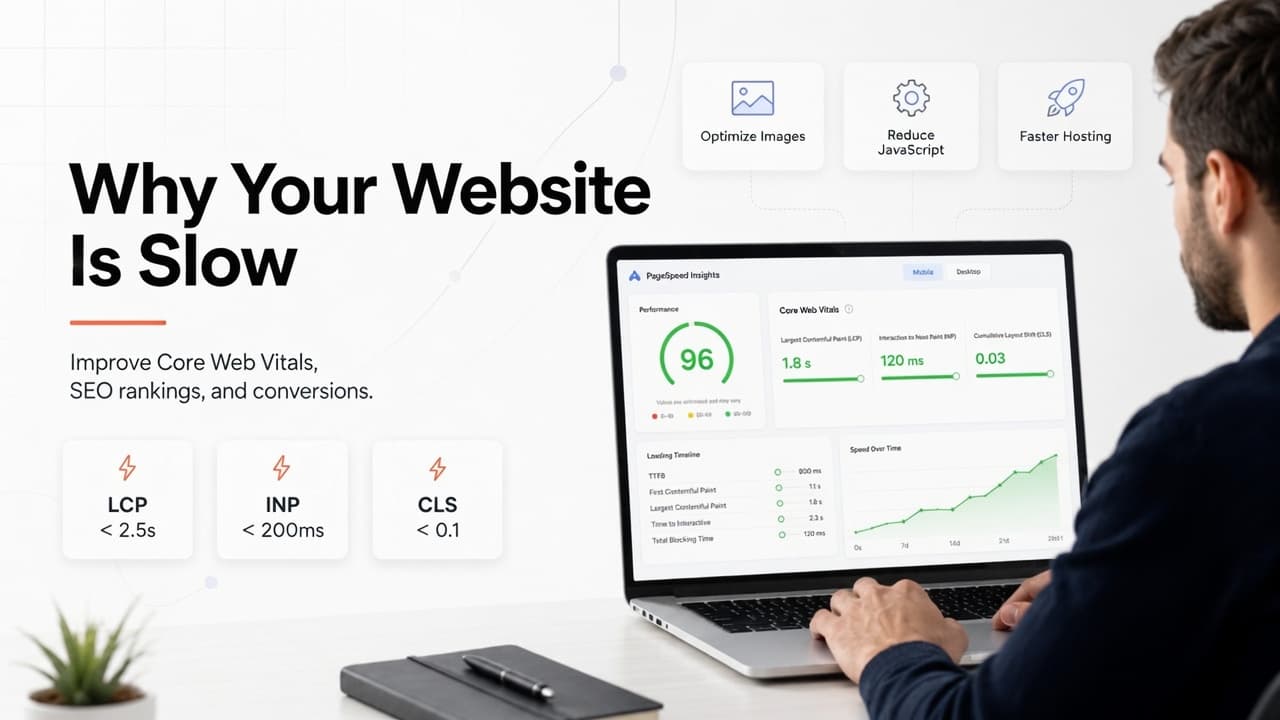
Why Your Website Is Slow (And How Core Web Vitals Affect Sales & Rankings)
A slow website isn't just annoying; it's quietly costing you rankings, leads, and sales, usually without anyone on the team realizing it. Here's what Core Web Vitals actually measure, why they matter more than most businesses think, and where to look first.
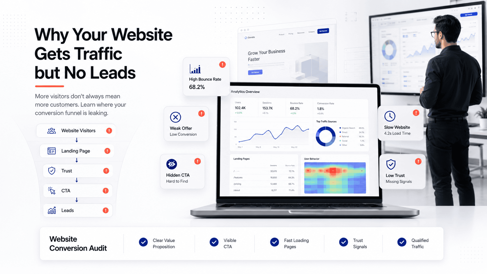
Why Your Website Gets Traffic but No Leads (And How to Actually Fix It)
Thousands of visitors a month and an inbox that stays quiet, it's one of the most confusing problems in business, because everything on paper says the marketing is working. It's not a traffic problem. Here's what's actually going on and how to fix it.